
In addition to the blog article, I have inserted a link to a video I made on the subject.
Video Demonstration Of Color Grading
Video Demonstration Of Color Grading
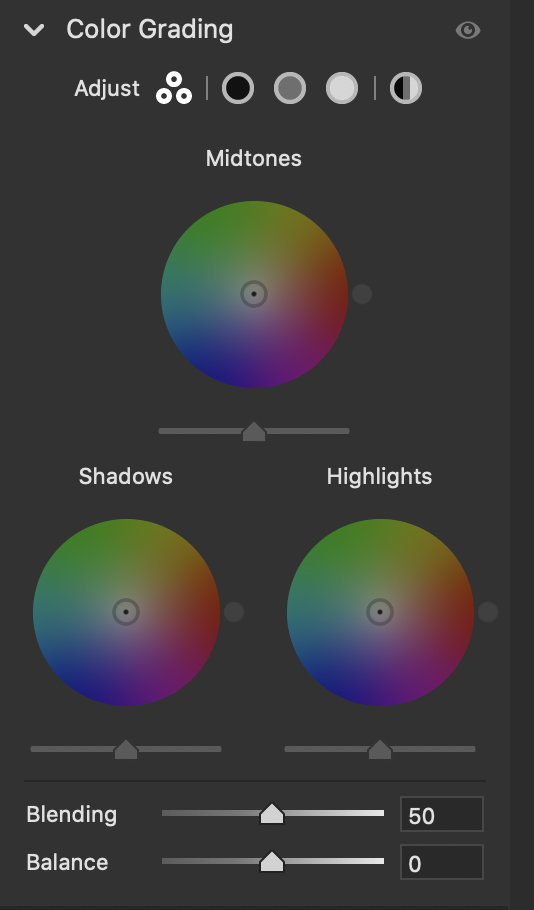
The familiar Split Toning in Camera RAW and Adobe Lightroom has been removed and replaced with Color Grading. For those familiar with video editing, the new tri-color wheel will be familiar to you. You are now presented with three different color wheels—one for each tone: highlights, mid-tones, and shadows. Previously with split toning, you only had the option to change either the highlight or the shadows. With the new color grading tool, you can now adjust mid-tones. You can then tone them with color and adjust the intensity of that color.
When you open up “Color Grading,” you are presented with three different color wheels, each one for the different tones. Within that color wheel, you have a cursor selection. By moving that cursor left or right, you can adjust the hue of the color. Moving that cursor closer or further away from the center of the wheel adjusts the saturation. A new Luminance slider below the color wheel allows you to make brightness changes to that specific color. If you had chosen a cooler color like blue on the color wheel, you could make the blues darker or brighter based on the Luminance slider. The slider is not labeled, but you can find it directly under the color wheel.

Double-clicking on the cursor resets the sliders to zero, and you can click the eyeball at the bottom of each color wheel to turn on or off the effect.
Some of the keyboard shortcuts used with this new tool are really beneficial for making small incremental changes. Once you decide on a color and saturation, you can hold down the Command button on a Mac or Control for windows and get another important option. A second circle is presented within the color wheel that allows you to move it around and see changes directly to the image based on that saturation level. This can be very handy for dialing in color when unsure about the direction of color balance.
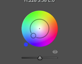
A second keyboard shortcut that I use is holding down the option, making the wheel much slower. This is very helpful when you have a color and want to fine-tune that adjustment. Lastly, holding the Shift key once you have a color you like allows you to adjust the color’s intensity or saturation. The shift key presents a straight line from the center of the color wheel, and you can go up or down.
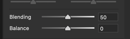
In addition to the “Color Grading” Tool, a slider called the “blending” slider allows you to blend the colors chosen more to the shadows or the highlights. This is a nice addition as it does an excellent job of blending the colors. Below is the balance slider, which allows you to shift all of the adjustments towards either the highlights of the shadows.
The second option of adjusting the “Color Grading” tool is choosing from one of the specific tones at the tab’s top. Rather than making the color wheel adjustments, you have a series of sliders that make the changes. All the options that are available with the color wheel are also available. Very important to choose the drop-down arrow on the right to see the expanded options. This is my preferred method, as I can really be exact about the changes I am making.

The last option, after making adjustments to the three separate tones, is a global tone. This allows you to make an overall adjustment to the combination of all three tones together. In effect, this shifts all three tones toward a certain color. Overall, I’m very excited about the new color grading tool. It’s nice to be able to adjust my mid-tones as well as my highlights and shadows. Also, the extra slider provides the necessary flexibility to acquire the exact tones and colors.
Website: www.kevinmcnealphotography.com
Facebook: https://www.facebook.com/kevinmcneal30
Instagram: www.instagram.com/kevinmcneal30
Flickr: https://www.flickr.com/photos/kevinmcneal
Kevin McNeal is a landscape photographer who resides in the Pacific Northwest of the U.S. He focuses on grand colorful landscapes that reflect the most unique places on earth. Capturing moments of magic light and transferring this on print, images behold a combination of perseverance, patience, and dedication to capture the images in ways unseen before. The stories of how these images are rendered come across in the feelings the images convey.
Recent Comments