
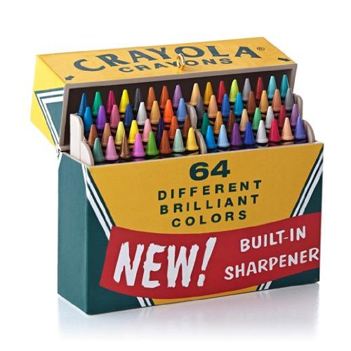
Why Do I Need to Calibrate my Monitor?
I was building a presentation for a printing workshop I’m teaching with Sean Bagshaw next week and I thought I would share some thoughts on this subject. This is a practical guide, I want to keep it simple and not get bogged down in the technical aspects of calibration. This question comes up a lot when I’m teaching workshops and doing art shows. It’s something that is often overlooked, yet is one of the most important things you can do in digital photography. Calibrating and building a profile for your monitor is important because, you want to be using the same metaphoric box of crayons as other professionals, printers, publishers etc. You want to be sure that the red you see on your screen is the same red as your printer, or the red seen by a publisher.
Doesn’t my monitor come calibrated? You might assume, as I did when I was starting out in digital photography, that your monitor comes well calibrated. There are some self calibrating monitors, but most monitors come with a factory calibration. I recently upgraded to a new 4k monitor, I thought it looked pretty good right out of the box, but once I ran the calibration software, I realized how far off the factory calibration was.
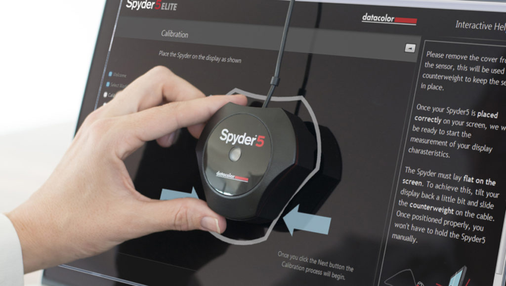
Calibrating your monitor is relatively simple. First, you’ll need to buy a calibration system. This consists of calibration hardware, and software. I use a Color Munki, but there are lots of good calibration systems out there, from companies like X-rite, Spyder and others. Next step is to install the software, run the software and follow the instructions. To keep things simple, the software usually has a setup wizard that will guide you through an automated sequence to build a profile automatically. This profile is then loaded in your settings within your computer’s operating system. This profile makes sure you have a shared standard color palette between your computer and monitor, the same metaphoric box of crayons, red is red, green is green and so on. There is often an advanced mode within the calibration software that allows you to make several customizations. One of those is allowing you to set your white point. I set mine a little warm on purpose for two reasons. One, I tend to like warmer images, I end up processing images too warm and this helps compensate. Two, I do a lot of printing for art shows, galleries and print orders. Those prints are almost never viewed in daylight corrected lighting. Usually they are viewed in a mix of natural daylight and incandescent light. I try to emulate that mix in my personal calibration. The colors in a print are still going to vary, but this gives me a good starting point to try to tailor prints for different lighting. This leads me to my next topic, ambient lighting.
Ambient lighting and how this effects the brightness in your monitor profile. This is a somewhat overlooked topic, but in my opinion, is nearly as important as using a monitor profile for color. The calibration software does calibrate for ambient lighting, but if you have windows letting in variable, changing light throughout the day in your processing space, it becomes challenging to properly judge image brightness on your monitor, or in a print. Some calibration products have an ambient light sensor built in, and will adjust your monitor brightness for you, but I notice the profiles still tend toward too bright. The solution that works best for me is to use black out shades in my office with good lighting to evaluate prints. I then make a print and compare it to what I see on my monitor. I will manually lower the brightness on my monitor further to calibrate to my printer. Having consistent, stable ambient lighting makes judging image brightness so much easier. Most students I’ve worked with have their monitors set way too bright to judge brightness for printing, or publishing. Obviously I’m basing this on a print color management system, but I still suggest considering your ambient lighting when setting your monitor brightness. Even if you are posting images only to be viewed on screens it’s still important to set proper brightness, or your images are going to look too dark for people who color manage properly.
There is a lot more that can be discussed on this subject and I may continue this series in the future to clarify and de-mystify some subjects.
To learn more about Zack you can visit his website: https://www.zschnepf.com

Location: Bend, OR
Website: www.zschnepf.com
YouTube: https://www.youtube.com/user/zschnepf77
Instagram: https://www.instagram.com/zackschnepf/
Zack is an award winning photographer specializing in fine art landscape photography and post processing. “Art is in my blood. My father is a well known poster artist and painter. My mom was a painter, and print maker and my brother is an art director at Facebook. Art is a way of life for my family, and I will hopefully pass it on to my children as well.”
“The love of nature is also something that my family and I are passionate about. I’ve been hiking, biking, rock climbing and backpacking since I was little. From an early age, I learned to appreciate the beauty in nature.”
Recent Comments